Museum Visit #2 (IASAS Cultural Convention)

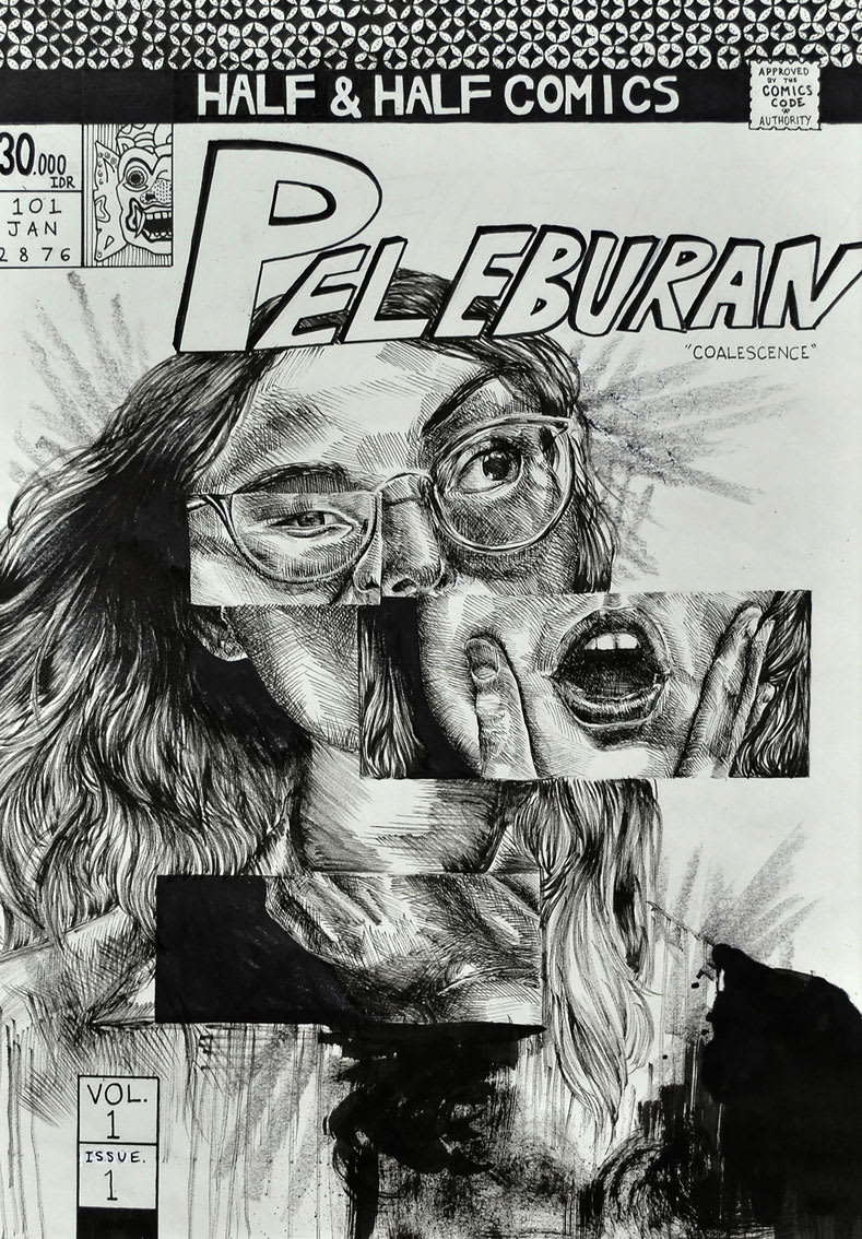
I really like the idea of trying to show someone being of mixed ethnicity in this way, by comparing the two stereotyped looks (the description said the subject was half Indonesian, half Australian). I also really love the amount of detail that went into making this look like a comic cover, like the CCA stamp, volume number, and also the shading on the skin. One thing I would change is the lettering of the title 'Peleburan' so it's not over the face (but maybe behind it), and also clearer borders around the feature panels.

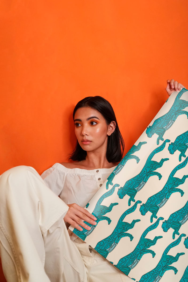
I loved this one because of the clear shapes and minimal colors. It's a simple design but it's effective for what it's made for (wrapping paper). It's extremely aesthetically pleasing, personally because of the spacing/placing of the patterns and color choice. I also really liked the clear lines on the jaguar/leopard vs the lineless style of the print with fish. There's a good variety but all the paper looks like it belongs in a collection.

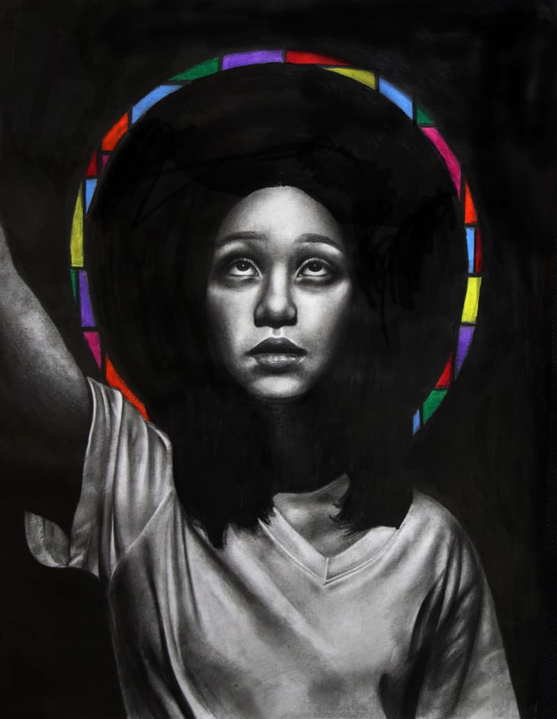
This was one of my favorite pieces out of all I saw on display. I really like how dark the graphite is in the background, and how the hair becomes part of this black, almost showing the figure engulfed. This black is in high contrast with the brightness of the white on the subject's face and shirt. It makes the figure stand out. I love the idea of the colored halo, which looks like stained glass. It gives the piece a very cathedrial-like feeling, for the lack of better words. I also like how purposeful the position is, how everything is centered and almost symmetrical save the figure's raised arm. I like this decision because it makes the piece feel oddly religious (in a good way).

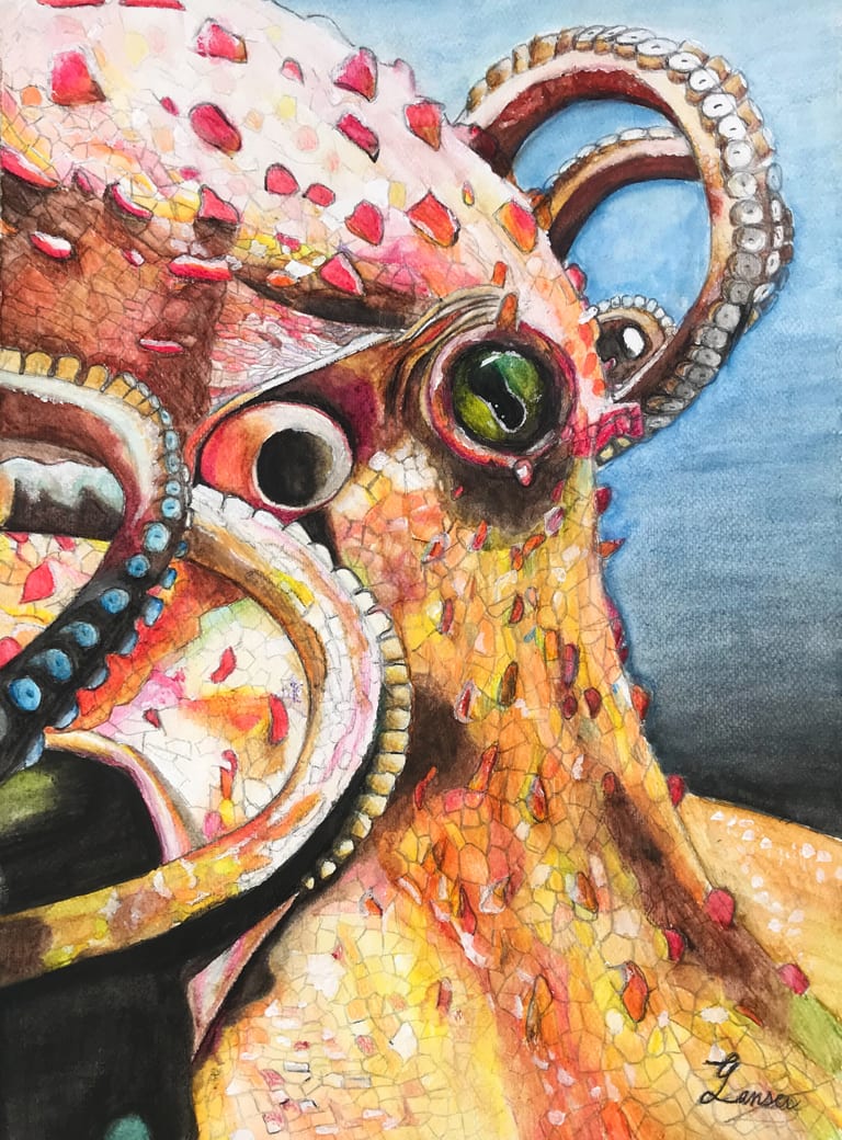
This piece is called 'THE COLORS OF THE OCTOPUS', which immediately points out my favorite thing about this piece: the colors. Although I feel they could be bolder, I really like how warm and bright the colors are. I think the blue to black gradient in the back is a little bit distracting, but I still really like the focus/purposefulness of the warm colors. I also really like the shapes, the loops of the tentacles, the circle of the eye vs the circle of the siphon, and the various scattered stubs.

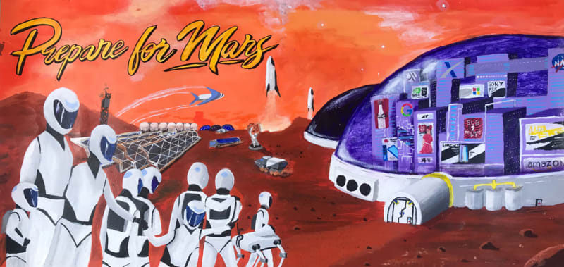
I love how this piece is trying to look like a vintage travel poster, but for the future. I really like the color choice, the direction (and how it leads your eyes), and I had a good laugh at the little Easter Egg details in the done ('sub 2 pewdiepie'). One thing I would add is more detail to the space people in the foreground, as it looks a little bit mismatched with the number of tiny details in the back. Besides that, I admire the aesthetic this was going for.

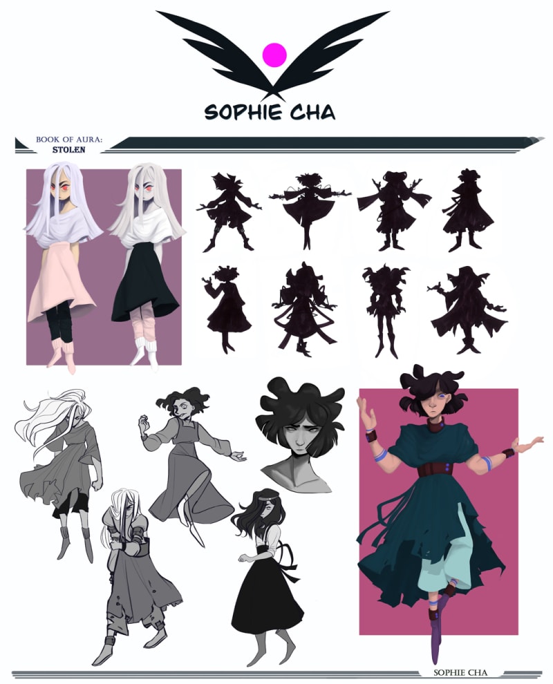
Wow, I love that the silhouettes are placed right next to the final designs, it gives good insight into the designing/thought process. The greyscale concept sketches on the side really add to the sheet as a whole. I like that the designer had a limited color palette (which closely follows the 60-20-10 color rule), and didn't busy themselves with too many details. I really like the flow in each character, how the movement is very clear. If I had to make a similar character sheet, I might have added small scattered notes about the character to add more to the viewer's knowledge and get them even more intrigued beyond the design.
Comments
Post a Comment